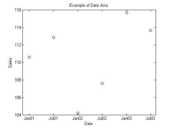
One of the most common questions for Matlab users is how to plot data on a date axis. Many times, an analyst will initially use Excel, but then decide that he or she wants more analytical capabilities or plotting options. Excel has an easy way to plot data on a date axis, but to use a date axis in Matlab requires familiarity with a few functions. Don’t worry, using Matlab for this task is not that hard and, like most of Matlab’s functions, allows a considerable degree of versatility.
A few functions with which a Matlab user should get familiar are datenum, datevec and datestr. Matlab encodes every date into a number, starting with January 1, 0000 as the number 1. Using datenum, the user can specify a date and time with either a string or several arguments. To retrieve the date and time from datenum, the user can use datevec. Matlab uses the output of datenum for x-axis data on a plot.
For example, assume that you want to plot data over 3 years at 6-month intervals. You would start by creating vectors for the days, months and years that you want to plot. After that, convert those vectors to date numbers, and plot the date numbers against your data. Next, set the ticks to correspond to your date numbers, use datestr to convert your date numbers to date strings and set the tick labels to the date strings.
%Set up dates
years = [2001; 2001; 2002; 2002; 2003; 2003];
months = [1 7 1 7 1 7];
days = ones(1,6);

for k = 1:6
  dates(k) = datenum(years(k), months(k), days(k));
end

%Plot Data
plot(dates, 100 + 20*rand(1,6), 'o')

%Set Ticks
labels = datestr(dates, 12);
set(gca, 'XTick', dates);
set(gca, 'XTickLabel', labels);

%Label Axes and Set Title
xlabel('Date')
ylabel('Sales')
title('Example of Date Axis')
 I realize that my implementation requires more work than the example on the Mathworks Help website, but their results resulted in date ticks that did not lie on all of the correct dates for my example. The Mathworks method using datetick probably works for many applications, but using the method in this post will result in date ticks that are exactly where you want them for any dates.

Eric ,Thanks for your example
That was really helpfull but i have a problem. My code is:
for i=1:1000
dates(i)=datenum(day(i),month(i),year(i),hour(i),min(i),sec(i));
end
stem(dates, 100 + 20*rand(1,1000))
labels=datestr(dates,0);
set (gca, ‘Xtick’, dates);
set (gca, ‘XtickLabel’, labels);
but it returns an error on line set (gca, ‘Xtick’, dates);
saying that “Values must be monotonically increasing”.
Any ideas how to go about it?